
Ellen Lupton — Senior Curator of Contemporary Design at Cooper Hewitt, Smithsonian Design Museum, New York City.
[Transcript of video]
I was asked to do a little bit of a talk and conversation about a quintessential American object and I picked this. I think the very fact that there’s a dozen of them sitting on the table represents the ubiquity that this object once had in our culture. We do have one in the collection of Cooper Hewitt.
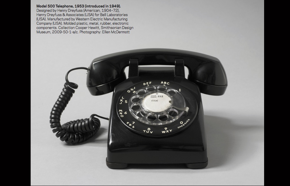
This happens to be my personal one that I carry around in my purse. It is designed by Henry Dreyfuss who is one of the pioneers of the profession of industrial design. Cooper Hewitt is home to the Henry Dreyfus archive and to many original drawings created by his firm, as well as many objects that he designed, including things like buttons for tractors.
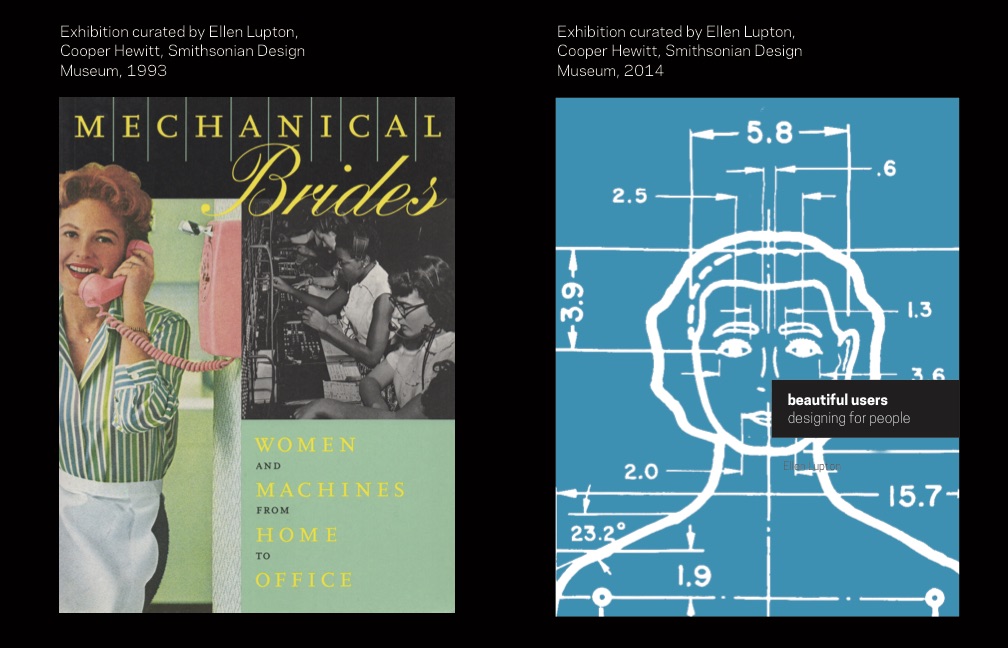 I have been looking at this object for my whole career here at Cooper Hewitt, and I thought it would be fun to share with you two exhibitions that are literally 20 years apart, actually 21. This was my first show at Cooper Hewitt called “Mechanical Brides”, which opened in 1993 and this is “Beautiful Users” which opened in 2014. This phone is a character in both of these stories.
To speak a little bit about observation and sort of my techniques of the observer in this bit of a career, my first goal in “Mechanical Brides” was to try to look at machines, household, and office appliances from a feminist lens and to ask: “What is this story here about women and women’s history?”. And I’ll tell you a little bit about that undertaking here. On the cover of the book, we see this idyllic archetypal housewife. She is connected to these women at the switchboard and that was a female dominated profession until about 1981. Only women were telephone operators. So there is this kind of a connection between the technology and female identity, which was fun for me to uncover. And I took the title of this show “Mechanical Bride” from Marshall McLuhan’s great piece of pop culture analysis from 1951. And of course, Marshall McLuhan got the phrase from Marcel Duchamp and this kind of history of fascination with sex and machines.
As a young curator, it was clear to me that women were really underrepresented in the classic design professions in the 40s and 50s There just weren’t very many women working. Women were very strongly figured as the consumers and users of technology. I spent a lot of time tearing up Life magazines and Ebony magazine and just looking for evidence of the visual culture of these kinds of machines. “Love, honor, and crisper toast!”, the young GI comes home from war and he is greeted by this toaster that is all hot and ready to go. Or this kind of refrigerator designed by Henry Dreyfuss. This ad showing the kind of nuptial event of being delivered to your refrigerator. This wonderful housewife is freed by her machines to have more time in her day to serve breakfast to her family. So it’s really interesting for me to look at the stories here that were being told in advertising about the role of women. And women considered the primary consumers of many of these products that exploded in the consumer economy of the 50s. One of the chapters of “Mechanical Brides” was called “The Voice with a Smile” and it’s all about the telephone.
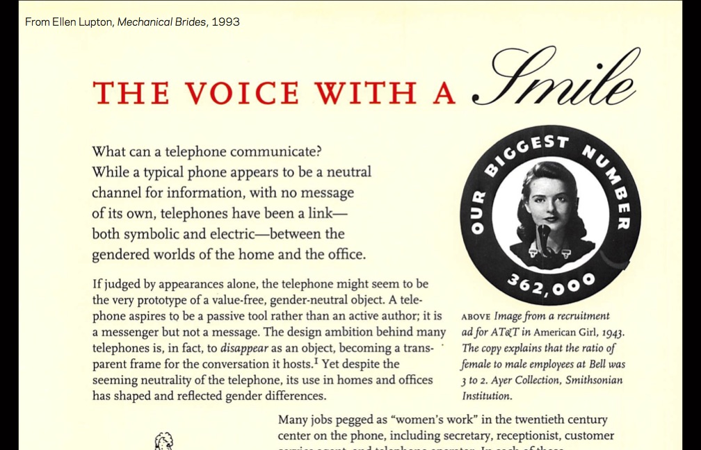
And this was something that I discovered doing my research; that the telephone was this object that was connecting women in the home as housekeepers and mothers. The attendants using technology to take care of everybody. Women in the workplace, where they were increasingly being employed and were using machines like typewriters, but also telephones, to do their work.
AT&T had this phrase: “the voice with a smile” which referenced the beautiful, melodic voice of the telephone operator when you needed assistance. That’s one of their ads from the collection of the Smithsonian Advertising Collection at the Museum of American History. This telephone operator with her arms stretched across America in this maternal embrace — that’s her tool. She’s connecting your call from New York to California, as opposed to the kind of image of the man. The male telephone executive, with little toy airplanes flying around his face, who is this powerful figure and making things happen. And she is the telephone mother.
So I was very fascinated with this and with humor around women talking too much and women using the phone for gossip. When phones were first introduced by AT&T they really didn’t want women talking so much on the phone. They thought this is a serious instrument that should be used to call the doctor in an emergency. Women shouldn’t be tying up the line with their idle chatter, and then they soon discover that, actually, this was their market. That using the phone to socialize and relax was actually valuable, and women became more actively invited to use the telephone. But always stayed objects of derision about being chatterboxes and talking too much. There is the image of the telephone operator. and there is a whole sexual tradition around the phone.
In the early 20th century there is a whole genre of sexy postcards. If you go to a postcard market — as I’ve spent many hours in — there’s a whole category of telephone postcards that are all about flirting and this kind of sexual activity.  That the telephone suddenly made young women available through the ear, in a way that they had previously not been so accessible. These were intended to be quite provocative and racy — little postcards about sexual activity. I love this architecture here, where we have that brick wall and literally the phone is breaking down that barrier between man and woman and it’s “Give me love!”.
Henry Dreyfuss designed this phone, which seems like a completely kind of neutral object that’s sort of the Helvetica of telephones, also from the 50s, Helvetica.
And he went on to create other models of the phone that were more specifically gendered like the Princess Phone which is literally called a “princess” and was marketed at a new consumer group: the teenage female — for use in her bedroom as an extra phone.

So you might notice when you play with these phones how beat up and shitty they are, and it’s because these were not loved. These were not considered beloved consumer products. They were actually owned by the telephone company, and when you rented telephone service the phone was simply part of it.
People didn’t have a relationship, they weren’t choosing phones as something intimate, the way now we have this very personal relationship with our phone.
Something like the Princess Phone was an add-on that was like a cool extra. You pay more and your daughter can have her own phone in her bedroom. It was designed to be very light. I wish I had one with me here — it weighs like half as much. It has a little light in it, so it lights up at night, and it has this kind of feminine form, this kind of reclining nude form. The handle is exactly the same: Henry Dreyfuss had spent many, many years with Bell Labs and with his team ergonomically designing the perfect handle. And what made it perfect is many things: One is that you can do this [holding phone between shoulder and head]. When the telephone was invented nobody imagined that people would be desiring hands-free talking. I still feel like it hasn’t been figured out, how to do that. Earlier models had a ridged edge that made the phone turn on your shoulder. So they started with the handle which is your most intimate point of contact, so when you take your phone home, many of them, you can actually detach the handle, take it to bed, put it in your under your pillow.
This is where he started the design, because this is the part of the design that you touch the most and have the most intimate relationship. Everything else about the phone is built around the handle.
The Princess Phone has a new body, but the same handle. Originally, you just have one phone in your house that would ring really, really loud so you could hear it everywhere. There is dad with an extra extension in his den, and he’s accompanied by his dog. So we have this metaphor of the comfort and man’s best friend and the wonderful dog. And here is beauty on duty, and she is accompanied by her vacuum cleaner. She’s taking a break from her hard day of housework, having a coffee and chatting on the phone. There’s always a story there. The wall phone was introduced specifically for the kitchen — again as an extra extension that you would pay more money for, it has the same handset. But it’s a telephonic equivalent of a wall mounted kitchen cabinet. So it’s not taking up space on your counter. Dreyfuss was thinking about youth, and how people actually live, and what they do with their stuff.
I love this image of just kind of euphoria around the phone. That’s “Mechanical Brides”, and this is my more recent show “Beautiful Users”, and I think this is kind of a feminist cover too.
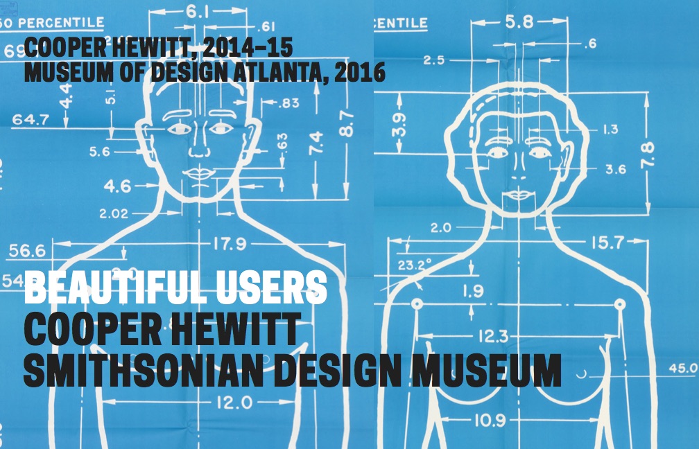 I took this famous drawing that Henry Dreyfuss did of Josephine, who is the normative female figure that he used ergonomically to create products for women for. And somehow, by making her big, she becomes a portrait, she becomes like a person. And so “Beautiful User” kind of came back to the phone — looking at it 20 years later, and talking more about ergonomics. Again, this is Dreyfuss’ earlier design that doesn’t feel good on your shoulder, and in our exhibition people could pick up this and actually have a body experience with it and understand that difference.
Dreyfuss was really interested in creating standards and discovering how to create objects that actually fit people’s bodies, instead of people having to fit their body to the product. And that was one of his revolutionary principles that we still very much value as designers today.
In order to do that, he had to create these kind of norms and standards. There’s the wonderful handset which he designed first, and it is such a great thing. He responded to a discourse in the design field about the normative body — about the ideal body. This is Ernst Neufert who created this diagram in the 1930s and this drawing is still used all around the world as an architectural standard. Neurfert created a whole universe of products whose proportions were all based on this one character — this one figure — and this book has been translated into every language on the planet.
It is still used in the education of many designers and architects. This is from the 50s where the designer is actually thinking not just about a single perfect human form, but about social interaction and bodies in space, bodies communicating with each other. In this project, I got really excited about how user is represented. Who is this user that architects and designers are trying to create things that match? This is from Henry Dreyfuss’ book, “Designing for People”, and that is Joe, who is the mate of Josephine, and he is the ideal normative human figure. There they are, these are life size drawings that you can still get on eBay. I got a set for ten dollars that had been deaccessioned from a public library, that’s what curators do. I have these life drawings of Joe and Josephine, which is really fun.
Neils Diffrient is a designer who worked in Henry Dreyfuss’ office and he was thinking that this norm is not enough. We have to create a much more nuanced sense of human life and human experience and create people in wheelchairs and people that are of shorter stature taller or heavier or pregnant. He created an entire much more nuanced system for measuring human life, which is now being reissued by a designer in Switzerland, which is very exciting. 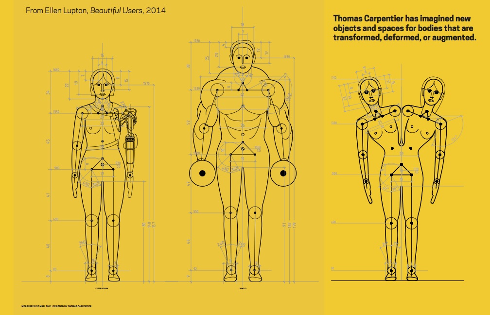 As you move from Ernst Neufert with his kind of Aryan ideal to Josephine to this human scale drawing, it’s like more and more numbers, more and more detail, more and more nuance, more and more variety. But always within a norm, always within the 95 percent. This is by Rolf Faste, who was an advocate for designing for people with disabilities, and he was against the idea of a norm and more thinking about all the parts of a body where someone might have difficulty extending their reach, or functioning, or having sensory difficulties: so another way of looking at the user. And then finally this is Thomas Carpentier, who’s a young French designer who created his own set of, kind of, ideal man but based on these outside-the-norm figures.
Now I’m really interested in this area of design for disabilities and the bodies that fall outside of that 95 percent. If you’re interested in this area, I think there was somebody in the group who’s a disability expert, I’d love to hear more on this.
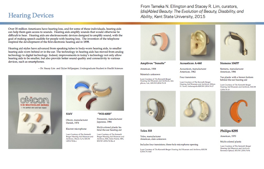 I love this article by Beth Williamson, it’s the greatest kind of history of universal design in our American industrial design tradition. She talks about the idea of creating products for people that don’t hide disability but celebrate it, and kind of acknowledge the beauty of other bodies. Or looking at the history of hearing technologies, which actually the telephone came out of a kind of interest in deaf communication. These are hearing aids that look like jewelry and the way they celebrate the hearing aid but they’re also hiding it, trying to obscure it as a kind of decorative object. These are kind of fascinating areas to look at products and how they relate to a broader scope of human experience. This is the great Good Grips potato peeler. How many of you have this potato peeler? It’s designed to feel awesome in your hand. And as the story goes, Sam Farber was married to a woman who had rheumatoid arthritis, and he became aware of her distress in trying to peel potatoes in her kitchen, and that she had pain in her hand and wasn’t really able to peel potatoes properly.

And so he worked with designers at Smart Design to create this legendary potato peeler, and, as you know, based on the grip on a bicycle handle, and changed the world, right? Like I would not make mashed potatoes if I did not have this potato peeler. I kind of wanted to ask, like, a feminist question about this sacred object which is, why couldn’t Sam Farber peel his own potatoes? It comes back to a story about who’s doing what in the kitchen, and I’m grateful to have it because I like mashed potatoes. But I also just want to ask about the user and what what does that represent?
Ellen Lupton
Ellen Lupton is a writer, curator, educator, and designer. She is Senior Curator of Contemporary Design at Cooper Hewitt, Smithsonian Design Museum in New York City. Recent exhibitions include Beauty—Cooper Hewitt Design Triennial (with Andreas Lipps), How Posters Work, and Beautiful Users. Lupton also serves as director of the Graphic Design MFA Program at MICA (Maryland Institute College of Art) in Baltimore, where she has authored numerous books on design processes, including Thinking with Type, Graphic Design Thinking, Graphic Design: The New Basics, and Type on Screen. Her next book, Design Is Storytelling, will be published by Cooper Hewitt in 2017. Lupton earned her BFA from The Cooper Union in 1985.